My research focuses on designing tools to help people interact more effectively with visual information, a process that is guided by and evaluated through studies of user behavior. For my thesis, I am designing tools to make the insight generation process more transparent to fellow users of shared visualizations. I have also designed a pre-brainstorming tool and looked at how people perceive information on large displays and on mobile devices.
About
Hello! I am a UX Researcher at Google. I recently completed my degree in the Technology and Social Behavior joint PhD program at Northwestern University, where I worked in the CollabLab with my awesome advisor Darren Gergle. I am broadly interested in how we as HCI researchers can design and build a better user experience, particularly with respect to visual analytics, creativity tools, and across different devices.
I graduated from Cal in 2007 with a custom major that focused on designing information technology for society. As an undergrad research assistant, I designed the interface for a massively multiplayer online birdwatching game and studied social uses of Flickr and cameraphones.
In addition to research, I enjoy UI and interaction design as well as all aspects of user-centered design. Some of my design work can be seen here.
Research
Sharing insight provenance in collaborative visual analytics
with mentorship from Darren Gergle, Mike Horn, Liz Gerber, and Matt Easterday
My thesis looks at how people gain insight from interacting with visualized information. Many visualizations today provide users with a structured exploration of select views. These stories were carefully created to guide the viewer to a concluding insight found in the data. I develop tools that enable the average user to create similar stories by easily recording their path to insight as they interact with a visualization. New users can then see these paths and perhaps learn from them, so that they in turn may interact with visualizations more effectively, gain new insight, and make the most of these ever growing quantities of visualized data.
Visualizing hyperlingual Wikipedia
with Brent Hecht, Mike Horn, Darren Gergle
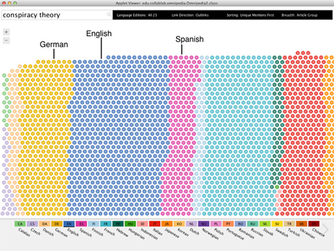
Wikipedia has been shown to exhibit considerable diversity in content and coverage across its many language editions. However, unless you are highly multilingual, it is difficult to access most of this information. To address this problem, we developed Omnipedia, a Java application that highlights the similarities and differences that exist among Wikipedia language editions, and makes salient information that is unique to each language as well as that which is shared more widely.
Smart phones for business
with Jeff Pierce, Steve Whittaker, Shumin Zhai at IBM Research—Almaden
Despite the rapid innovation of smart phones in recent years, there remain many barriers to smart phone use in business environments. Focusing on both objective measures and subjective beliefs surrounding task performance on smart phones and traditional computers, we provide a snapshot of smart phone use that helps to elucidate these barriers. We also propose design considerations for overcoming these barriers.
Brainstorming and creativity support tools
with David Hoffman, Liz Gerber, Darren Gergle
Group brainstorming is a common practice in organizations that often suffers from a lack of focus and unreliable production of quality ideas. While many creativity support tools have been built to support events during a brainstorm, we introduce a tool to encourage small amounts of individual preparation just prior to a brainstorm. The results of this preparation are then revealed and visualized to the entire group. Early tests suggest that prompting individuals to think about the upcoming brainstorm, however briefly, may help groups to focus and ideate more efficiently.
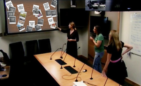
Large displays and language use
with Darren Gergle
Understanding the relationship between visual context and language use is critical for developing multimodal interfaces that support natural forms of interaction. In these studies, we isolate one component of visual context - the physical size of the visual display - and examine its influence on spoken linguistic expressions. Results suggest that even subtle differences in technological factors, such as display size, can affect how people perceive and interact with visual information. Such findings could inform the design of interfaces across multiple devices.
Portfolio Selection
My interest in user-centered design is what led me to HCI research. Below is a sample of my work from recent research projects to former extracurriculars. Projects range from UI and graphic design to product concepts and collateral for target audiences.
2011-2012 // Omnipedia Application
Omnipedia is a Java application that I designed and developed with Brent Hecht in order to facilitate multilingual Wikipedia exploration. Omnipedia has gone through several iterations and we are constantly working to improve the user experience. I am responsible for the visual design and general appearance, including all interface components and the interactive visualization. You can find much more about Omnipedia here.
2011-2012 // Omnipedia Prototypes I
One of our design goals with Omnipedia was to make clear the surprising amount of diversity in how different Wikipedia editions cover a given topic. For these iterations we chose to map language edition onto color, knowingly challenging vis conventions so that the diversity and complexity is obvious and in order to help repeat users retain some degree of color memory. This screenshot is a fun mockup that didn't make it into the system but shows one of the ideas I had for making more effective use of space.
2011-2012 // Omnipedia Prototypes II
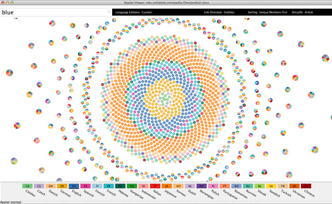
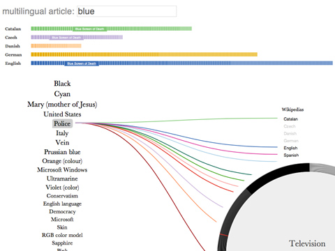
Ultimately we would like to put Omnipedia in the hands of real users, so we have been considering different means of making it web-based. This image is a sneak peek at three lightweight prototypes I designed using JQuery and SVG. These were part of a quick iteration process – since the Java codebase is so huge, I developed these using JSON feeds for select topics, like Barack Obama (always popular among our pilot testers) and the color "blue" (shown here). An interesting example that you can see in the middle is that not every language associates the color blue with police, but those that do may be motivated by blue police uniforms in their geographic hearth.
2009 // Momentum Brainstorm Tool
During a collaboration with the Creative Action Lab, we kept coming across systems that people have built to assist groups during a brainstorm, but found little research on preparatory work. This inspired us to develop Momentum, a system to automate the creation and sending of "provocative" prompts about an upcoming brainstorm, forcing participants to think about it beforehand. I worked on a Flash display of everyone's responses to be shown during the brainstorm. We observed that the display expedited the lead-up time during idea generation and invited greater participation.
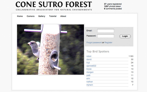
2007 // CONE-SF User Interface
CONE is a collaboration between Texas A&M and Berkeley that uses a combination of sensors, cameras, and human input to remotely observe natural environments in order to track wildlife (specifically the ivory-billed woodpecker in this iteration). Previous systems were problematic in that humans still needed to go through and identify the content of automatically captured photos. Adopting a NASA Clickworkers model, CONE uses gamification to encourage human participation. I was responsible for designing the front end interface and worked closely with a developer to integrate the camera features with other interactive and community-building aspects of the site. I was also involved in brainstorming the user model for the project.
Some nerd pride: this got covered by Slashdot, Boing Boing, and Wired!
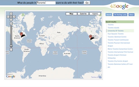
2006 // API Mashup
I was fortunate to be able to take some graduate courses while at Cal, one of which taught different methods of "remixing" information on the web. I created a mashup of 43Things, a social goal-sharing site, and Google Maps. I thought it would be interesting to visualize the goals that people have set based on their location, which might reveal interesting regional trends. My app parsed data from 43Things and passed it in XML to Google Maps, where you could then pick a city and compare the top 20 goals listed by residents, as well as click through to their complete personal goal lists.
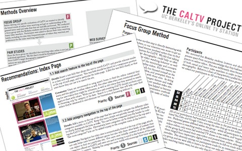
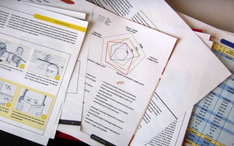
2006 // CalTV Usability Study & Design
My group project for another graduate course on assessing user needs and website usability targeted CalTV, a student-run video news site that had been suffering from declining viewership. We used four evaluation methods (focus group, web survey, pair studies, and interviews) and drew up a set of final design and content recommendations. I designed this report in order to present our evaluation methods and final design and content recommendations.
2005 // Yahoo! Ad Campaign
Each year the American Advertising Federation holds a competition for college chapters with real clients, and this year it was Yahoo!. We had to fit an entire year's worth of market research and ad campaign development into 32 pages and make it stand out. I was in charge of designing the plansbook and drew a series of concept sketches before creating the final page templates. Each department wanted to include different types of information, so each section of the plansbook had to be adapted and rearranged. As our campaign theme was connectivity, I used circular shapes and connecting lines to bring the layout together. We went on to win Regionals and placed 4th in Nationals, while our plansbook placed first both times.
2005 // Berkeley Innovation (BI)
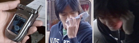
is a multidisciplinary student group that proposes innovative design solutions in order to improve student life. One project I led was Project Extra-Sensory Phone (ESP), which addressed miscommunication between cell phone callers and receivers. Our goal was to bridge the gap between expectations of both parties through saying more by saying less.
In a deep dive session, we produced short video clips demonstrating three product concepts for ESP. 1000 Words Phone (left) takes the idea of 'a picture equals a thousand words' literally. The phone takes a snapshot of the user's current environment and sends it as a visual 'away message' to callers while the user cannot be reached. Smelly Phone (middle) emits a smell on the receiver's end in order to be able to quickly identify the caller and his/her environment, which performs an instant recognition function. Mood Phone (right) uses color indicators to help the receiver pick up on the caller's mood, perhaps by using voice analysis or temperature sensing. This could potentially be used to enhance phone communication for people with autism.
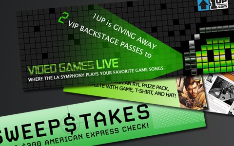
2005 // 1UP.com Collateral and Usability
As an undergrad, I interned at 1UP.com, an online gaming community from Ziff Davis that incorporates editorials and news features. This is one of the contest graphics I designed as an incentive to get user feedback. I also helped to write online usability surveys for the site, conduct a video project studying gamers at home, and rebuilt a missing magazine ad for Computer Gaming World.
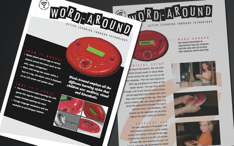
2004 // Word-Around Graphics
My friend and Berkeley Innovation colleague developed an educational toy for a graduate mechanical engineering course and needed a poster for his tradeshow. His group was in the process of applying for a patent, so I created two posters and a temporary logo for the show.
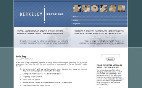
2004 // Berkeley Innovation (BI)
BI is a multidisciplinary student group that proposes innovative design solutions in order to improve student life. Our projects ranged from shuttle-bus tracking systems to lecture-friendly ring tones (think coughs and zippers), with all sorts of fun brainstorms in between. Most projects follow the process of identifying a user need, framing it in terms of the user experience, and then brainstorming and rapidly prototyping possible solutions. I designed and created a new look for the website (above), switching over to an automated content management system in hopes of facilitating better documentation of current and future projects.